Hey there!
After a few weeks of work, the new website is at a place I’m happy with. I’ve tried to keep it as minimal as possible, since it’s way too easy to go crazy with extra junk that just clutters up the space. As-is, I think it looks pretty sharp!
The site is built on WordPress, and although it might be free, it has plenty of tricks up its sleeve. Plugins are easy to find, and can really bring a site up a notch in terms of looks and function. Really cool stuff – though it was definitely scary at first glance! I definitely didn’t feel comfortable with the layout and workflow at first, but now that I have a bit of experience with it, it’s easier to make tweaks and changes to make the site look exactly how I want. Pretty exciting!

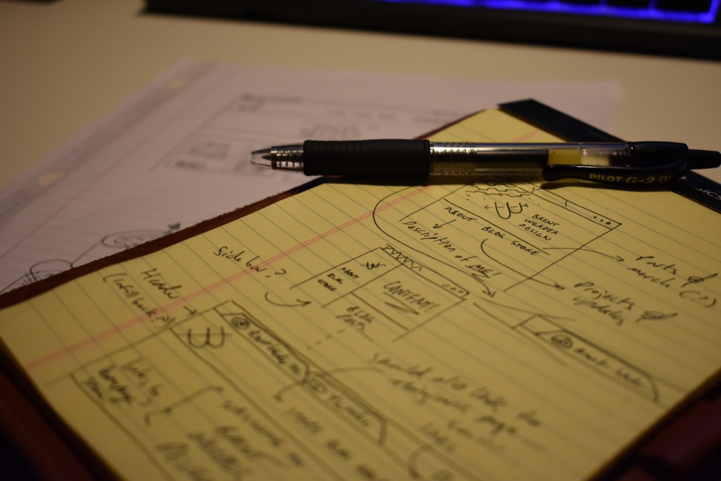
I went through a few concept sketches to illustrate what I wanted to accomplish, but it didn’t take too many iterations before I was happy with the final product. Also… I’m a total beginner in web design, so I leaned heavily on already available themes for WordPress. Plugins like Elementor helped me make the site look unique, but I tried to not stray too far away from defaults to avoid getting lost.

So far, I’m pretty happy with the look of the page! I’m sure it’ll continue to grow and change as I add new things to it—like the shop!—but for now I think it’s a good start. It gives me a pretty versatile platform to start sharing a ton of the projects I’ve been doing over the years, and a place to start documenting new ones in a more cohesive way.
Anyways, that’s about all I have to say. I’m excited to get started here!
Thanks for dropping by, and stay tuned for more CONTENT soon!
-Brent


